
Click on image to enlarge


Josef Albers
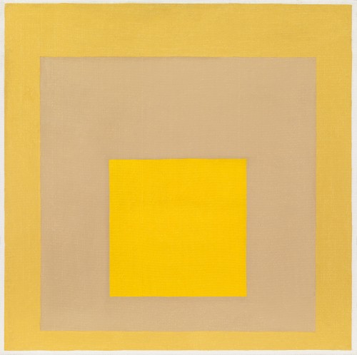
Study for Homage to the square: Mellow
Oil on masonite: 24 x 24 (in) / 61 x 61 (cm)
Signed with monogram and dated lower right: A60; signed, dated and inscribed on the reverse
This artwork is for sale.
Please contact us on: +44 (0)20 7493 3939.
Email us
JOSEF ALBERS
Bottrup, Germany 1888 - 1976 New Haven, Connecticut
Ref: BV 209
Study for Homage to the Square: Mellow
Signed with monogram and dated lower right: A60; signed, dated and inscribed on the reverse
Oil on masonite: 24 x 24 in / 61 x 61 cm
Frame size: 24 ½ x 24 ½ inches/ 62.2 x 62.2 cm
In an aluminium bead frame
Registered with the Anni and Josef Albers Foundation as no:
JAAF 1960.1.54
Provenance:
London Arts Gallery, Detroit;
Private collection, USA, acquired from the above in 1971
Exhibited:
Essen, Museum Folkwang, Josef Albers, 6th February-3rd March 1963, no.25
Kunsthalle Bern, Marcel Duchamp, Wassily Kandinsky, Kasimir Malewitsch, Josef Albers, Tom Doyle, 23rd October-29th November 1964, no.154
Paris, Galerie Denise René, Albers, March-April 1968, no.5
Detroit, London Arts Gallery, From Constructivism to Kinetic Art: A survey in two parts, 1968-1969
This painting will be included in the forthcoming catalogue raisonné of the work of Josef Albers currently being prepared by the Anni and Josef Albers Foundation and is registered as no: JAAF 1960.1.54
This bright, serene canvas exemplifies the positive appeal of yellow, which Nicholas Fox Weber, Executive Director of the Josef and Anni Albers Foundation, explains Josef Albers considered the colour of ‘curing, caring and uplift.’ In apparent contrast to the rigorous, hard-edged forms and meticulous application of pure, unmixed hues, the subtle, alluring combination of colours elicits an emotional as well as a perceptual response. With close observation and absorption, the soft, buttery golden shades of cadmium yellow light in the centre and Naples yellow in the outer square, flicker, advance and recede around the pale, skin-toned Naples yellow reddish, which seems to vary with each lingering glance, as if subject to constantly changing light. Albers was profoundly influenced by the German Romantic writer, Johann Wolfgang Goethe’s Theory of Color (1810), which stated of yellow: ‘In its greatest purity it always conveys the quality of brightness, and has a cheerful, vivacious, mildly exciting character…a strong yellow on lustrous silk (e.g., satin) has a magnificent and noble effect. We also experience a very warm and cozy impression with yellow. Thus, in painting, too, it belongs among the luminous and active colors…The eye is gladdened, the heart expands, the feelings are cheered, an immediate warmth seems to waft toward us.’[1]
Edward Alden Jewell, critic for The New York Times, suggested that the artist-instructor himself was possessed of a ‘mellow wisdom’, quoting a text written by the artist for the Black Mountain College Bulletin: ‘Life is more important than school; the student and the learning more important than the teacher and the teaching. More lasting than having heard and read is to have seen and experienced.’[2]
From his early days as a student at the Bauhaus in Germany, Josef Albers was fascinated by the interaction of colour. After immigrating to America with his wife Anni in 1933 he became an art teacher at the ground-breaking Black Mountain College in North Carolina and in 1950 became Head of the Department of Design at Yale University where he taught Willem de Kooning, Robert Rauschenberg and Robert Motherwell, while continuing to pursue his exhaustive exploration of colour theory. Albers began his most famous series ‘Homage to the Square’ in 1950 and devoted the next twenty-six years to producing more than a thousand works of art including paintings, drawings, prints and tapestries. The series provided an in depth investigation of the chromatic relationship between concentric squares of colour, examining the optical effects produced by adjacent hues. With its rigid, geometric structure, the square provided an ideal format for Albers’ experiments, on to which he applied paint straight from the tube with a palette knife in one smooth layer. The resultant interaction of flat planes of varied colour created the illusion of their advancing or receding in space.
In 1972 Albers oversaw the publication of a review of work entitled Formulation: Articulation. In the introduction, the author and curator Gerald Nordland wrote ‘The purpose of his colour studies was to prove that colour is the most relative medium in art, and that we almost never perceive what colour is physically. He called the mutual influencing of colours interaction.
He taught us that our optical reception can be turned inside out, so that we see opaque colours as transparent, and perceive opacity as translucence. Albers compelled his students to learn to see again, and to be questioning of their vision. He pointed out that colour offers uncertainties and "perceptual ambiguities" where three colours can be made to look like four or like two, by changing their colour environments’ (Josef Albers, Formulation: Articulation, New York, 1972).
Josef Albers, Study for Homage to the Square:
Departing in Yellow, 1964, Oil on fibreboard: 30 x 30 in / 76.2 x 76.2 cm, Tate
JOSEF ALBERS
Bottrup, Germany 1888-1976 New Haven, Connecticut
From his early days as a student at the Bauhaus in Germany, where he subsequently taught foundation courses in both Colour and Preliminary Design, Josef Albers was fascinated by the interaction of colours. After immigrating to America with his wife Anni in 1933 he became an art teacher at the ground-breaking Black Mountain College in North Carolina and in 1950 he became Head of the Department of Design at Yale University where he taught Willem de Kooning, Robert Rauschenberg and Robert Motherwell and where he continued to pursue his exhaustive explorations of the theory of colour. An artistic pioneer, Albers’ ground-breaking approach to colour and form led to the development of both ‘Hard-edge painting’ - which used straight, clean linear patterns to create a three dimensional effect on a two dimensional surface and ‘Op-Art’ - which relied mainly on mathematics and colour theories to achieve dramatic effects. Both movements were considered a reaction against the subjective emotionalism of abstract expressionism which had dominated US art in the 1950s.
Begun in 1949 ‘Homage to the Square’ is Albers most famous series, he devoted the next twenty six years to producing more than a thousand works that included paintings, drawings, prints and tapestries. The series provided an in depth exploration of chromatic relationship between several concentric squares of colour by examining the effects that adjacent colours have on one another when processed by the human eye and the optical illusions created by flat planes of colour advancing or receding in space. With its rigid, mathematical elements the square provided an ideal format for Albers’ experiments, applying the pigment with a palette knife directly from the tube the artist was fascinated by what he called ‘the interaction of colour’ whereby the central square, lying between the inner and outer squares, would subtly take on the hue of the neighbouring square. In Homage to the Square: Recurring Theme the bright, golden tones of the three squares present an optical progression that encourages the eye to move outward from the centre of the composition registering a variety of tones and colours.
In 1972 Josef Albers oversaw the publication of a review of work entitled Formulation: Articulation. In the introduction the author and curator Gerald Nordland wrote ‘The purpose of his colour studies was to prove that colour is the most relative medium in art, and that we almost never perceive what colour is physically. He called the mutual influencing of colours interaction. He taught us that our optical reception can be turned inside out, so that we see opaque colours as transparent, and perceive opacity as translucence. Albers compelled his students to learn to see again, and to be questioning of their vision. He pointed out that colour offers uncertainties and "perceptual ambiguities" where three colours can be made to look like four or like two, by changing their colour environments. "Each colour has different properties both as colour and as buttery paste. Each has a different density; in spite of this, I want them all to behave; to do what I want and not what they want... One must taste and taste in order to cook just right... Until one has the experience of knowing he is being fooled by colour, one cannot be expected to be very careful to look at things inquiringly. Only comparison entitles one to evaluation... I want to imbue others with my delight in the endless possibilities for new colour experiences." ‘(Josef Albers Formulation: Articulation, New York, 1972).
[1] Johann Wolfgang Goethe, Goethe: The Collected Works Volume 12, Scientific Studies, ed. and trans. Douglas E. Miller, Princeton, 1995, p.279.
[2] Nicholas Fox Weber, ‘I want the eyes to open’: Josef Albers in the New World’, Albers and Moholy-Nagy: From the Bauhaus to the New World, exh cat, Tate Publishing, 2006, p.108.

