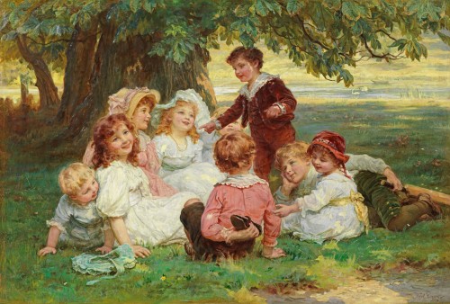
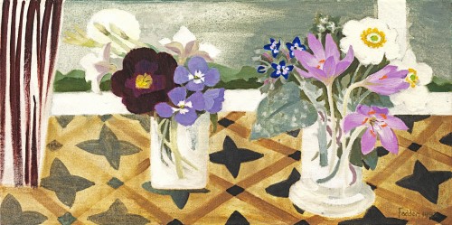
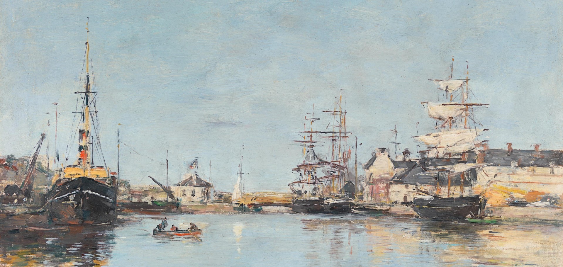
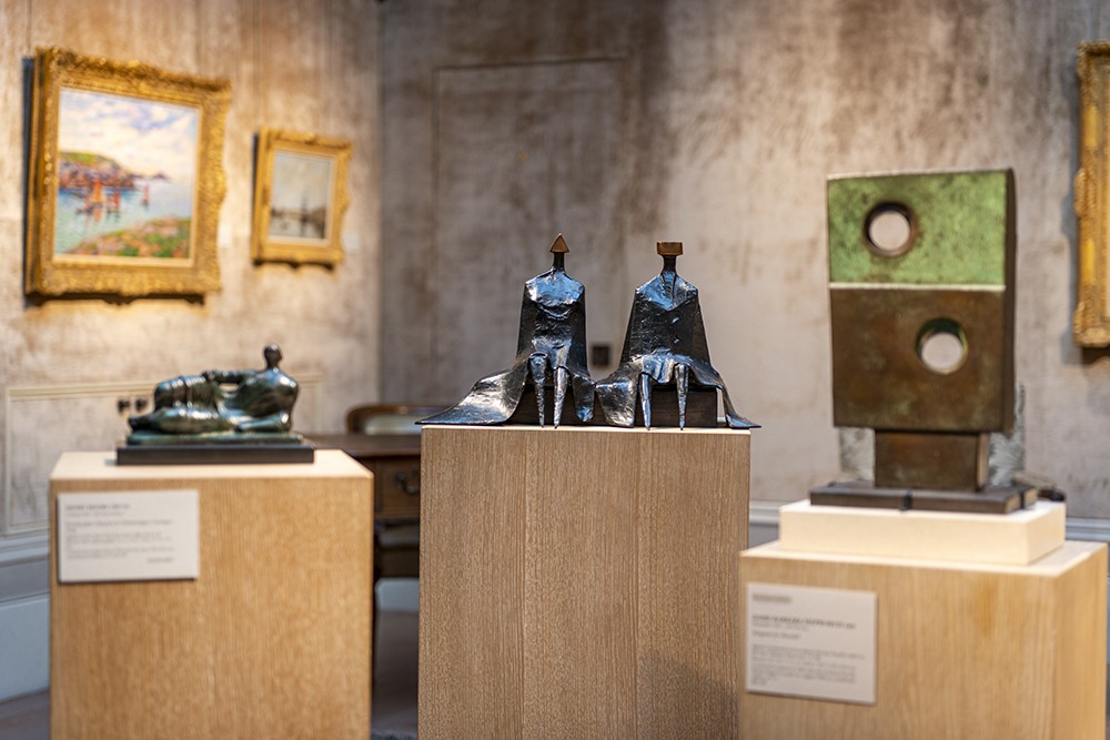
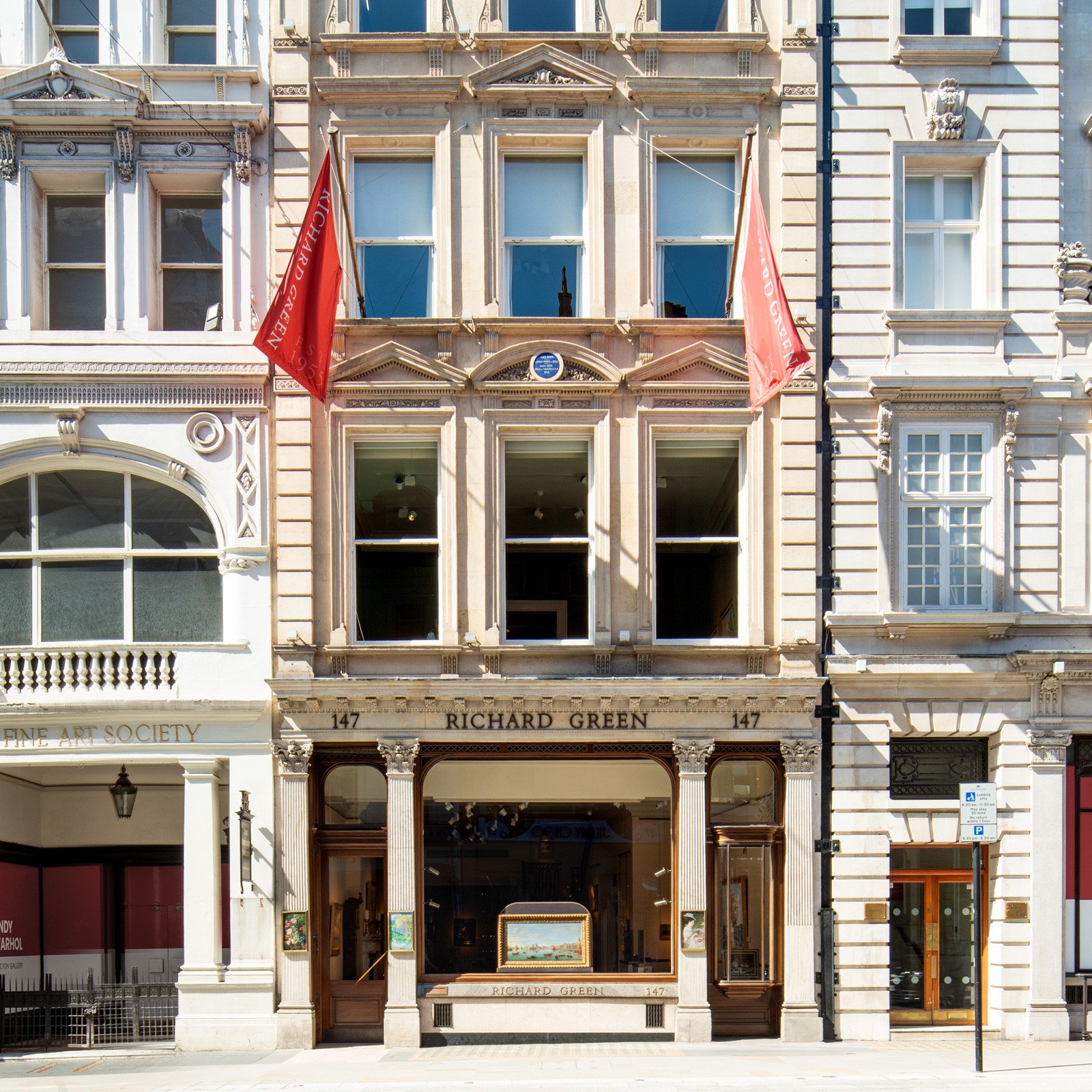
Wilhelmina Barns-Graham
Red and violet, 1961
Oil on canvas: 36(h) x 28(w) in / 91.4(h) x 71.1(w) cm
Signed, dated and inscribed on the top and bottom stretcher: _x000d_
RED AND VIOLET 1961 W. BARNS-GRAHAM
This artwork is for sale.
Please contact us on: +44 (0)20 7493 3939.
Email us
WILHELMINA BARNS-GRAHAM CBE
1912 - St Andrews - 2004
Ref: BZ 222
Red and violet 1961
Signed, dated and inscribed on the top and bottom stretcher:
RED AND VIOLET 1961 W. BARNS-GRAHAM
Oil on canvas: 36 x 28 in / 91.4 x 71.1 cm
Frame size: 38 x 29 ¾ inches / 96.5 x 75.6 cm
Provenance:
The artist;
The Wilhelmina Barns-Graham Trust
Celebrated in the 1950s as Britain’s leading female abstract painter, Wilhelmina Barns-Graham rented a studio flat in London from 1961-63, continuing her research into the interaction of shape and colour which she would later refer to as the ‘Order and Disorder of Things of a Kind’ series. These hard-edged, pure abstract works use geometric shapes, in particular squares, to investigate colour theory. Inspired by the Basic Design course at Leeds, where she taught life drawing and painting in the late 1950s, Barns-Graham developed a more systems-based approach to abstraction founded on the principals of the Bauhaus in 1920s Germany. ‘Josef Albers (1888-1976), who left the Bauhaus in 1930 for the USA, was particularly interested in the idea of colour as active and subjective. Basing his influential colour course on Chevreul’s discoveries and involving students in multiple colour experiments, Albers demonstrated that colours in themselves are not absolute and stable, but constantly changing in relation to their context.’[1]
Exhibiting a striking palette of brilliant and muted colour, the present work contrasts calculated quantities of pure hues in squares of decreasing size, offset to accentuate a sensation of movement and tension. Near the top of the vertical canvas against a resonant blue ground, a large square of vivid scarlet balances precariously upon a tilted square of royal blue, which itself rests on a cropped, oblique square of light blue next to a smaller form of opulent violet. Though vigorously applied and showing darker ground beneath, the titular colours sing out in jewel-like hues from their recessive, cool surrounds. While rigorously exploring colour theory, Barns-Graham’s expressive application of paint suggests her personal response to the subject and frame of mind. Colour held particular emotional value for Barns-Graham who ‘experienced a form of synaesthesia that associates colour with people, places, numbers and letters, with a particular emphasis on word and colour association, known as grapheme-colour synaesthesia.’[2]
[1] Virginia Button, Wilhelmina Barns-Graham, Sansom & Company, Bristol, 2020, p.90. ‘The principal of complementary colours or ‘simultaneous contrast’ had been established in the nineteenth century by the French chemist Michel Eugène Chevreul (1786-1889), whose theories had been absorbed by the post-Impressionist pointillistes and in the teaching of colour theory at the Bauhaus.’ Ibid.
[2] Ibid., p.86.